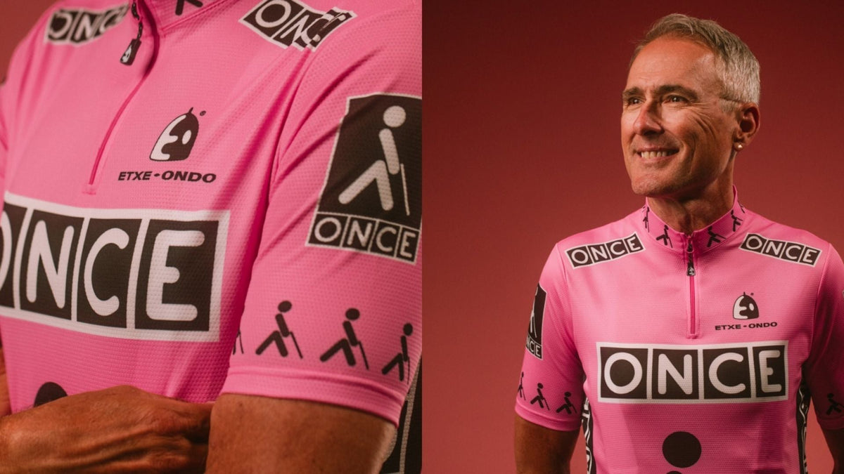
Yellow was the problem.
For most of the season, it made ONCE easy to spot. The Spanish team’s bright jerseys, broken up by black sponsor panels, had exactly the visibility a sponsor wanted. At the Tour de France, though, yellow already belonged to someone else: the leader of the race.
So ONCE changed clothes. Its best-known Tour alternative was pale pink, a color that became almost as closely associated with the team as its regular yellow. [4]
If you’ve seen both versions and wondered which one is right, the answer depends on the race and the year. The pink jersey wasn’t a faded yellow shirt, a fashion experiment, or a Giro leader’s jersey. It was ONCE solving a very specific problem.
The original yellow was carefully chosen
In an interview published by kit maker Etxeondo, designer Paco Rodrigo described a surprisingly practical way of judging a racing jersey: watch it on television.
ONCE’s corporate colors were green and yellow. Rodrigo developed a bright yellow racing design with white lettering on black panels, testing how well the identity carried through a broadcast. The sponsor’s name and its pictogram of a person with a cane also had to fit the limited space on a rider’s torso.
The Tour alternatives took a little time to settle. Etxeondo’s account identifies diagonal green, gray, and yellow designs in 1990 and 1991, before the later pink solution. That makes “ONCE always wore pink at the Tour” a little too tidy. [1]
The interesting part is how much survived the color change. The lettering, dark panels, and general arrangement still did their work. Changing the background didn’t require rebuilding the team’s identity from scratch.
There were exceptions, too. Cyclingnews’s contemporary 2002 FAQ notes that ONCE’s 2000 kit was judged different enough to keep its yellow, while in 2002 the team used pink for road stages and its regular colors for the team time trial. A specific photograph deserves a specific date. [4]
What those four letters represented
ONCE is the Spanish National Organization of the Blind. The team began in 1989 under Manolo Saiz, with the organization’s lottery business behind its sponsorship.
That context gives the jersey more meaning than a familiar four-letter logo. The cane pictogram wasn’t incidental decoration. It referred to the organization whose name the riders carried.
William Fotheringham’s history of the team for Procycling, republished by Cyclingnews, describes a squad that became a disruptive force in professional racing. ONCE’s willingness to attack was an important part of its public identity. The clothing made the riders easy to find; the racing gave people a reason to keep watching. [2]
There’s a useful distinction here between a shirt that photographs well and a shirt people remember. Television visibility can be designed. The associations that build around a team take racing, repetition, and time.
Pink could look pretty aggressive
The color itself didn’t make ONCE a gentler presence in July.
At the 1995 Tour, Laurent Jalabert’s long attack toward Mende put pressure on Miguel Indurain and gave ONCE one of its defining afternoons. Alex Zülle eventually finished second overall, with Jalabert fourth. Fotheringham uses that campaign to show the team’s appetite for taking the race to stronger favorites. [2]
That’s a more interesting way to remember the pink jersey than treating it as an unusual shade on a clothing rack. It belonged to riders trying to unsettle the Tour.
Contemporary reporting helps establish how familiar the look became. A July 1996 Irish Times report referred to ONCE as the team in pink. By then, the alternative color was recognizable enough to carry the description. [3]
For a sponsor, that’s a useful outcome. A change made to avoid confusion had created a second recognizable version of the same team.
Two colors and two different stories
The yellow ONCE jersey tells the story of the team’s everyday identity. The pink one adds the complication of riding the Tour, where a team’s sponsor colors had to coexist with the race’s own visual system.
That’s also why a pink ONCE shirt shouldn’t be read the way you’d read the Giro’s maglia rosa. One identifies a team in a particular setting. The other identifies the leader of a race. Similar color, different message.
Retrolica’s ONCE collection includes the pink interpretation. Its appeal is more specific than simply being an eye-catching retro jersey: it recalls a team recognizable enough to change its main color and still look unmistakably like itself.
Sources
1. Etxeondo — Paco Rodrigo on ONCE jersey design and visibility
2. Cyclingnews — The yellow armada and how ONCE shook up pro cycling
3. The Irish Times — Team in pink add green to yellow, July 10 1996
4. Cyclingnews — Contemporary 2002 Tour FAQ on ONCE’s colors